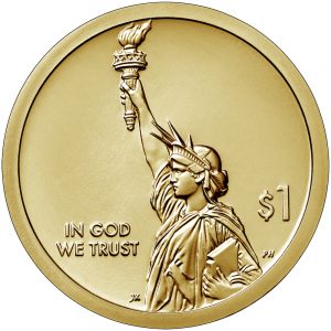
 Since U.S. Mint announced the launch of the American Innovation $1 Coin Program there has been nothing but complaints from the community about the coin.
According to the law (Public Law No: 115-97), “The common design on the obverse of each coin issued under this subsection shall contain a likeness of the Statue of Liberty extending to the rim of the coin and large enough to provide a dramatic representation of Liberty.” With the U.S. Mint under a short deadline because of when the bill became law (July 20, 2018), there were a number of disagreements with the Citizens Coinage Advisory Committee regarding the obverse design of the coin. The U.S. Mint tried to modify an old design but the CCAC did not like that. Eventually, the design from Miss Liberty’s left side was used.
It has turned out to be an elegant design that does not duplicate any previous one. She stands on the coin as stately as she stands in New York Harbor, extending from rim to rim as required by law. For once, the CCAC and I agree on a good design.
But that is not enough for some people. The design is too plain.
The reason why the coin appears plain is that two elements that could have been on the obverse, the date and motto “E Pluribus Unum,” are on the edge of the coin.
Edge lettering for the $1 coins began in 2007 with the introduction of the Presidential $1 Program. It was decided to move these elements, along with “In God We Trust” to the edge because the obverse was to include the years of the president’s term. Aside from providing more space for the design, relocating the date would prevent potential confusion as to the date of the coin.
“In God We Trust” was restored to the obverse of the coin in 2009 after striking errors caused the edge of the coin to be blank. This caused overzealous conspiracy theorists and the gullible believing that this was done purposely against the religious communities.
Some argue that since the conditions have changed, the coin should not have edge lettering.
Aesthetically, the obverse design was well executed. It would be how the statue would look if you were standing in Battery Park located at the southern tip of Manhattan, and looked across the water on a clear day. There should be no reason to change the design.
However, there is a problem with the edge lettering in that it makes it difficult to see. As someone who has reached the age where an annual eye exam is a requirement and “corrective lenses” is now a permanent fixture on my driver’s license, having the mintmark on the edge requires me to use magnification to find the mintmark.
As a member of the Baby Boomer generation whose glasses seem to get stronger every year, I would be in favor of moving the date and mintmark to the obverse of the coin. But if the problem is only aesthetics, then I have no problems with having to use a 16x loupe to help identify where the coin was struck.


Scott
I agree with your views. I would like to add that we much more serious problems in this country than the design of coins.
Sincerely
Bob