Speaking of apps, The Numismatic Bibliomania Society has created an app for its electronic newsletter, The E-Sylum.
For those who have not heard of The Numismatic Bibliomania Society, NBS promotes the use and collection of all types of numismatic literature. The E-Sylum is their weekly electronic newsletter sent to email subscribers interested in numismatic literature and other topics of interest. It can be best described as eclectic with news, reviews, interesting numismatic tidbits, and discussions from a broad range of numismatists, authors, and collectors. It is worth subscribing or reading the issues on line.
 While catching up with reading back issues, I found the announcement and immediately downloaded the free app from iTunes App Store. After a quick sync, the application was on my iPhone and ready to use.
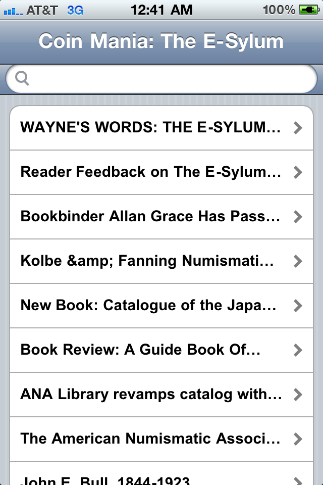
As with many apps, it opens with a splash screen with the NBS logo. After a few seconds, the app presents a list of articles from the most recent edition. So far so good as I tapped on the entry for the reader feedback on the app. I was then presented a page with the title of the article and a link that says “Read More.” I am not sure why the app does this. It should open the page with the text of the story. For me, this type of interface tends to become monotonous and turns me off to the app.
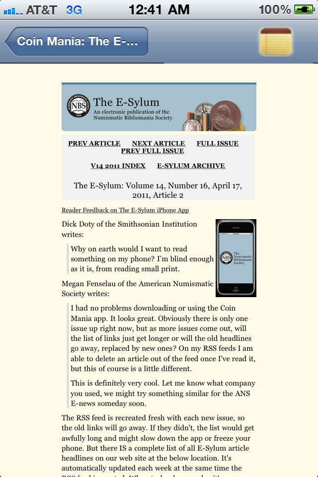 After pressing “Read More” I open up the web page from the NBS site with the story. The problem with this is that the article’s formatting is for a webpage to be read on the computer. This makes the text smaller and requires additional manual manipulation in order to read the article. I know it is possible for a website to tell what type of device is reading it. NBS should consider updating the style of the page to display better for the smaller phone screen when being read by the app.
Another element I found curious is that the upper-left corner of the reading pane has what looks like a Notepad icon. I was not sure what it did so I pressed it. The article pane slid over revealing a light blue page with “Back” and “Save” buttons at the top of the screen. I am not sure what this does, but the screen stays blue and the “Save” button does not seem to do anything. At least the “Back” button slides the reading pane back into view.
I asked The E-Sylum editor Wayne Homren for his comment about my review. Wayne said, “I had a company plug our feed into one of their standard app configurations and publish it. I agree that the navigation could be (greatly!) improved. My goal would be to have an app that works more like The New York Times app I use every day, with an easy way to flick from story to story with a swipe of your finger.” It has the feel of a first version (“1.0”) app.
I really wanted to like this app but these issues may prevent me from using it on a regular basis. I hope that these issues will be fixed in a future release. Right now, I would give the app a grade of AU-58, just short of being mint state because of that blue screen that does not seem to do anything. I hope that NBS fixes the app because I really want to like it!
Here are the screen images of the app I saved from my iPhone: