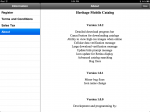
Heritage Mobile Catalog Opening Screen
This review is for the Heritage Mobile Catalog for the iPad only. Heritage has a separate app that works for the iPhone and iPad that is a wrapper around their mobile website. Do not confuse the two. The Heritage Mobile Catalog app is an application and different from the website. The Heritage app provides nothing more than what you can experience if you opened Safari on your iDevice and went to HA.com. For Android users, you are not missing anything by not having the Heritage App. I deleted the Heritage app from my iPhone and iPad.
The Heritage Mobile Catalog app is works in portrait and landscape mode on the iPad, but I found that using it in landscape mode looks better. When you open the app, you are presented with a number of virtual “catalogs” of Heritage’s various auctions. Even though this blog is interested in numismatics, I like to look at some of Heritage’s other auctions—which is why I now own some older political memorabilia. For this review, I selected the catalog for the August 3 Currency Signature Auction in Philadelphia.
The first issue that users will experience is this is not a “real-time” application. Before being able to browse an auction, you have to download the catalog. This can take some time depending on your connection. Even a more recent test using my home WiFi connection at full strength and no other activity I lost track of the time it was taking to download a catalog that was reported to be over 164 megabytes. All I remember was that during the wait I was able to make a bio-break and pour a beverage. If I was not trying to refresh my review, I would have given up and opened Safari to go to their website.

The Update dialog for the Heritage Mobile Catalog app.
You can avoid the dialog box if you press the “Update Bids” button. This will do the same as the dialog box, but you have to remember to press it first before pressing the “View” button to see the catalog. In either case, this is not a straight forward interface for the ordinary user. In fact, as a note to the project manager at Heritage, this type of interface reminds me of the book The Inmates Are Running the Asylum. The first half of this book makes it worth reading.

Gallery View in the Heritage Mobile Catalog app is similar to Apple’s cover flow.
List View really lets you get down to the business of browsing and bidding on the auction. While Gallery View is nice, you will probably use List View more. Both views allows you to sort the list by several criteria and the Refine button will let you search for specific items and let you narrow the display by relevant terms. While the images here are screen shots from a currency auction, the Refine Search adapts to the type of auction you are viewing.
Where the annoyance returns is the “My Heritage” button that does not offer a service but connects you to the Heritage website and uses the output from the website as the display. In order for an iOS application to open a web page, it has to bring up a separate window that overlays over the app. There’s a “clunky” feeling to this type of interface that I find annoying.
When you tap on an auction to bid on it, users of the eBay for iPad app will find familiar. There is nothing wrong with this interface because I think the Heritage version is a cleaner and a little more intuitive than the way eBay crammed everything into their version.

Bid screen in the Heritage Mobile Catalog app.
While I can speculate on why the Heritage Mobile Catalog app does this type of pre-loading, the bottom line is that it takes too long and does not update prices in “real-time” as their announcement claims. While other apps find ways to integrate their backend processing directly into the app, the Heritage Mobile Catalog has a “bolted-on” feeling. With the exception of the Gallery View, why should someone use this app over opening the browser and directly accessing the auction on the website?
I wanted to love this app but the interface annoyances has me using the website more than this app. It is like a mint state coin that is not well struck which is why I am grading this app MS60. Whomever is responsible for this app at Heritage should look at similar apps (eBay) and consider attending the next Apple World Wide Developers Conference to attend the course on what makes a good iOS interface.
-
- Heritage Mobile Catalog Opening Screen
-

- After the catalog is downloaded, the downloaded catalogs are sorted first in the Heritage Mobile Catalog.
-
- The Update dialog for the Heritage Mobile Catalog app.
-
- Gallery View in the Heritage Mobile Catalog app is similar to Apple’s cover flow.
-

- Even though Gallery View is fun, serious bidders might use List View more often in the Heritage Mobile Catalog app.
-

- Heritage Mobile Catalog sorting options.
-

- Heritage Mobile Catalog search and refinement options.
-

- Administrative interfaces in the Heritage Mobile Catalog app is directly to the Heritage website.
-
- Heritage Mobile Catalog app credits… who to blame! 🙂
-

- Using the search option to look for currency from Maryland in the Heritage Mobile Catalog app.
-

- MyHeritage display is nothing more than the reformatted webpage and not native to the Heritage Mobile Catalog app.
-
- Bid screen in the Heritage Mobile Catalog app.
-

- A different sort image in the Heritage Mobile Catalog app.
-

- Heritage Mobile Catalog app can only show you the catalogs you want to see.
&nbps;