Our first look back returns to April 2006 where I was able to examine the design changes of the $20 Federal Reserve Note following a visit to the ATM.
Money has always been a fascination because the design can reveal something about history. It interesting to look at a series of the same denomination and see the evolution as the times change. I had the chance see the evolution first hand when my bank’s ATM gave me three generations of $20 Federal Reserve Notes (FRN). Although I am not a banknote collector, I find their images and devices interesting.
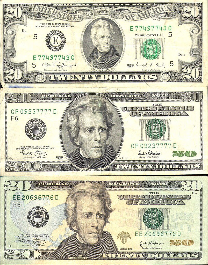
First, I found is the Series 1990 note with the signature of Treasury Secretary Nicholas F. Brady and Catalina Vasquez Villalpando, the Treasurer of the United States. Both Brady and Villalpando were appointed by President George H. W. Bush and served until the end of his term. Brady also served for six months under President Ronald W. Reagan.
The second is a Series 2001 note with the signatures of Treasury Secretary Paul M. O’Neill and Treasurer Rosario Marin. They were appointed by President George W. Bush during his first term. The third note is from Series 2004 with Marin’s signature along with Treasury Secretary John W. Snow, who succeeded O’Neill.
The $20 FRN was first designed for the Series 1929 small notes as an evolution of earlier designs for large currency. There is a lot of ornate and fine engraving with a green hue. The fine engraving has been a staple of bank notes since their inception as a means to prevent counterfeiting. The “greenback” was used to prevent copying using new photographic technologies which had a difficult time reproducing the green color. Although modern technology does not have the same reproduction issues, the green color remains out of tradition.
The newer notes do not feature a lot of fine engraving. The portrait of President Andrew Jackson appears on all of the notes but was enlarged on the newer notes with the border around the portrait removed on the Series 2004 notes. Another difference is the addition of color with a darker green hue and peach on the front.
The reverse on all of the notes features the White House. The Series 1990 note uses an image taken from the south lawn near the ellipse while the newer notes use an image from the north lawn that could be seen from Pennsylvania Avenue. The engraving of the White House is smaller on the new notes and the borders removed to allow the watermark and security thread to be easily seen.
I like the front of the latest note, but I don’t like the color. I also miss the indication of the Federal Reserve Bank for which the notes were printed. Although the designation of the issuing Federal Reserve Bank is not relevant anymore, it adds to the collecting pursuit for some people.
I like the south lawn portrait better than the one from the north lawn. I am disappointed with the starkness of the reverse. I am not sure that BEP can change this given the nature of the security features.
Finally, the attempt to colorize the notes is not working. It looks cheesy. If BEP colorizes the note, it should be more than just a gradient on the background. Many countries use color in their banknotes as part of the devices, not just to splash some color around to say “look at the color.” I think BEP can do better.