Whenever I comment on using design elements on coins that do not involve engraving I am reminded that one person’s gimmick is another’s innovation. I am also reminded that I have demonstrated a bit of hypocrisy by purchasing some of these coins for my collection including celebrating the innovation of one of these coins. So why do I have a near visceral reaction to the introduction of a coin whose purpose is to commemorate with a non-engraved design elements?
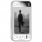
The question came to mind after the Perth Mint introduced the “Charlie Chaplin – 100 Years of Laughter 2014 1oz Silver Proof Lenticular Coin.” The coin is issued by the Pacific island nation of Tuvalu to honor the 100th anniversary of Charlie Chapin’s first movie appearance as The Tramp. The ingot-shaped coin features the Ian Rank-Broadley designed portrait of Queen Elizabeth II on the obverse and an image of Chaplin on the reverse.The reverse does not use just any image. It is the iconic image of the waddling tramp walking away from the camera. Like the image on the screen, this is a moving image. Using lenticular technology, the image will shift as you move the coin making it appear that Chaplin is walking.
Chaplin was the nascent movie industry’s first megastar. Although Mary Pickford and Douglas Fairbanks were the most recognizable of the time, Chaplin was the first actor whose movies were considered a success because he was involved with them. And while there were posters and booklets printed about other stars, Chaplin was the first to be fully merchandised around the world including a Chaplin doll that is one of the most prized toy and movie memorabilia collectibles today.
Even though Chaplin was the phenomenon of this time and I consider myself a fan, I am having a difficult time liking this coin.
In fact, I downright hate it!
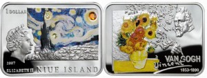
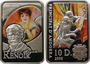
I cannot explain why I hate this coin because I am interested in the Niue 2007 Van Gogh silver coin and the Andorra 2008 Renoir 10 Diners silver coin. All three coins are colored coins and ingot shaped, but the Chaplin coin really bothers me.
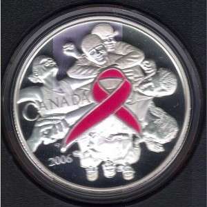
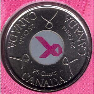
Although I did not like the Monnaie de Paris 2012 Yves Klein commemorative coin with the blue hand, I did not have this type of reaction. However, I still like the 2006 Canadian Breast Cancer commemorative and circulating quarter with enameled features.
One of the differences between the colored coins that I like versus those that I do not are the ones I like do have some engraving involved. And even though I do not like the Yves Klein commemorative, I do not find it as objectionable because the blue hand is an enhancement and not the entire design on the coin.
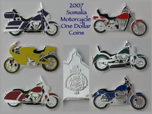
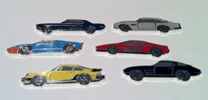
Not counting the Somalia motorcycle and sports car coins, I seem to have this response where the coloring or design gimmick encompasses the entire design of the coin. Once the coloring or other design elements that are not engraved go beyond enhancements and are used to create the design is when I begin to object.
It could also be the subject matter. As a resurgent gear-head with an eye toward the classics, the Somalia classic motorcycles and sports car coins appeal to me while the coins with colored birds and flowers do not. As the surviving spouse of a cancer victim, I supported the use of coins to raise money for cancer research by the Royal Canadian Mint, but none of the current hologram coins would interest me if they did not have the holograms.
Color and other enhancements on coins are here to stay. If there were not a market for them then the various mints would not produce these types of coins. It may be something that will attract more collectors and grow the hobby, which is good.
Maybe I should think about these enhancements like I think about cars: I want a car that drives and feels like a car and a coin that is engraved art; I do not want to drive a computer nor a coin that seems gimmicky.
- Image of the 2014 Charlie Chaplin 1-ounce lenticular silver coin courtesy of the Perth Mint.
- Images of the Van Gogh and Renoir coins courtesy of Talisman Coins.


I tend to agree: I think that it makes them look “gimmicky.” I was in Australia for a month and went to the Downies store, and so many colored coins just looked, well, kinda stupid. One example is the new Monopoly coins which, just like the Chaplin coin, was basically a silver square with a sticker on it.
That said, I’m like you and SOME colored coins I do admit to having. The 4-year Canadian “Crystal Raindrop” series, for example, and the new Australian (new as of 2012) constellation coin series (since I’m an astronomer). But in general, I steer clear of colored coins or ones with weird things in them like the Tiffany Art ones.
I know why I hate colored coins. It’s the same reason painting a sculpture with even perfectly realistic color is a crime. It defaces the underlying art.