What is going on at the U.S. Mint? For an organization whose actions are micromanaged by law seems to be finding a way to get around those rules to make some real questionable decisions.
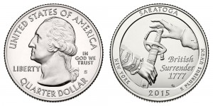
2015-S Saratoga National Historical Park Quarter
Just before the release of the S-mint quarters, the U.S. Mint changed its branding and changed the design of the Presidential $1 Coin Cover. Those of us who collect the coin covers now have two different formatted designs that shows when you show your 2010 Abraham Lincoln cover followed by the 2011 Andrew Johnson cover. And the change puts a thick black bar across the bottom forcing the portrait to be reduced making it an ugly design.
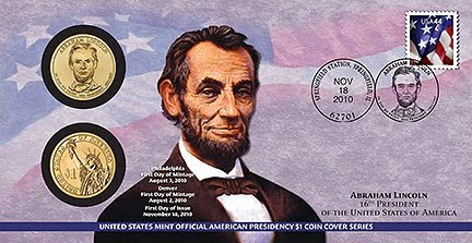
2010 Lincoln First Day Cover (before branding)
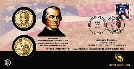
2011 Andrew Johnson First Day Cover (after branding)
Although I love the reverse proof coins and do not think including them in special sets, such as the 2015 Reverse Proof Roosevelt Dime as part of the 2015 March of Dimes Special Silver Set, but there are persistent rumors of a Presidential dollar reverse proof set. Why add a reverse proof set in the middle of a series? What is the U.S. Mint thinking? Adding a reverse proof to an existing series is as wrong as the S-mint national parks quarters.
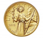
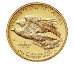
2015 American Liberty High Relief Gold Coin
Look at some of the past images of Liberty and they have a stronger look. Two of the most famous by Augustus Saint-Gaudens and Adolph A. Weinman has a striding Liberty that shows character. George Morgan’s Liberty had a regal look and Anthony de Francisi’s Liberty on the Peace dollar is just a marvel of beauty. This image is so uninspiring that I would buy the coin only because it is the first year of issue and has some investment potential. Otherwise, if I were to invest in 24-karat gold coins I would continue to buy the American Gold Buffalo.
2015 American Liberty High Relief Gold Coin Reverse
I know that the designs were approved by the Citizens Coinage Advisory Committee and the U.S. Commission of Fine Arts. But, as usual, their motivations and sense of design is really in question. Maybe it is time we drop one of these committees and streamline the process.
Expanding collecting options from the U.S. Mint is good for the hobby. However, adding options to existing series and ugly coins should be discouraged.
All other images courtesy of the U.S. Mint.

I totally agree, and I am glad that you have featured these issues. Thanks