The Bureau of Engraving and Printing unveiled the new $100 Federal Reserve Note earlier today in Washington, DC. Along with the watermark, security thread, and color-shifting ink, the new note now includes enhanced micro printing, a new application for color-shifting ink, and a security ribbon that appears to animate as the note is tilted. Since the $100 note is the most circulated and most counterfeited note in the world, the BEP has been working with the U.S. Secret Service and the Federal Reserve Board to stay ahead of the counterfeiters.
“The $100 is the highest value denomination that we issue, and it circulates broadly around the world,” said Michael Lambert, Assistant Director for Cash at the Federal Reserve Board. “Therefore, we took the necessary time to develop advanced security features that are easy for the public to use in everyday transactions, but difficult for counterfeiters to replicate.”
“As with previous U.S. currency redesigns, this note incorporates the best technology available to ensure we’re staying ahead of counterfeiters,” said Secretary of the Treasury Tim Geithner.
The redesigned $100 note includes a new security ribbon. The blue 3-D Security Ribbon on the front of the new $100 note contains images of bells and 100s that move and change from one to the other as you tilt the note as if it was animated. Next to the ribbon at the bottom of the front of the new note is the Bell in the Inkwell. The bell changes color from copper to green when the note is tilted, an effect that makes it seem to appear and disappear within the copper inkwell.
In addition to the new security features, the BEP also retained three security features from the old $100 note design including:
Portrait Watermark: Hold the note to light to see a faint image of Benjamin Franklin in the blank space to the right of the large portrait. It is visible from either side of the note.
Security Thread: Hold the note to light to see an embedded thread that runs vertically to the left of the portrait. The letters USA and the numeral 100 appear in an alternating pattern and can be seen from both sides of the note. The thread glows pink when illuminated by ultraviolet light.
Color-Shifting 100: Tilt the note to see the numeral 100 in the lower right corner of the front of the note change from copper to green.
“The advanced security features we’ve included in the new $100 note will thwart potential counterfeiters from producing high-quality fakes that can fool consumers and merchants,” said Larry R. Felix, Director of the Treasury’s Bureau of Engraving and Printing. “Protect yourself—it only takes a few seconds to check the new $100 note and know it’s real.”
The new $100 note also displays American symbols of freedom including phrases from the Declaration of Independence and the quill the Founding Fathers used to sign this historic document. Both are located to the right of the portrait on the front of the note.
The back of the note has a new vignette of Independence Hall featuring the rear, rather than the front, of the building. Both the vignette on the back of the note and the portrait on the front have been enlarged, and the oval that previously appeared around both images has been removed. Also on the right of the reverse is a large “100” printed in gold ink. It is expected that this feature will help those with visual impairments distinguish the denomination.
Review After the animation stopped on the front page of newmoney.gov the first thing I noticed is that Ben looks a little green. With a better use of color that does not make the note look close to the money seen in common board games, the portrait of Benjamin Franklin retains that green tint from the previous note while every other aspect of the note has changed. Since the BEP chose to use a portrait of an elderly Franklin, he looks like he could be ill.
As opposed to other notes, the there are no splashes of color that makes it look like a mistake. The design is better balanced and using the inkwell as a design element and part of the security features works well. If the BEP wanted to do better with color, it would have worked better by making the portrait of Franklin in color. That would have given the note a nice look and even seemed progressive in currency design.
The back of the note is still green. I guess if US currency will continue to be nicknamed the greenback, the BEP must keep the back of the note green. It is interesting that as part of the redesign, the BEP enlarged the “100” on the back of the note to take up almost the entire height of the area. It is being printed in gold. The size should help the visual impaired but it is unclear if the gold color will help those with visual impairments.
The most interesting change to the note is the 3-D security ribbon. It appears that the BEP has adapted holographic technology in a manner to embed into the fibers of the note to make it more difficult to counterfeit. It will be interesting to see how this looks with the note in hand since it looks very interesting in the videos distributed by the BEP.
It is a better redesign than their other efforts, but I would still like to see a better use of color.
Here is the Unveiling Video and B-roll videos produced for the BEP:
Unveiling Video
B-Roll Video 1
B-Roll Video 2
All images and video complements of the United States Bureau of Engraving and Printing.
On the 178th anniversary of its establishment as a Federally protected national site, the U.S. Mint launched the America the Beautiful Quarters Program with the launch at the Hot Sprints National Park in Arkansas. The ceremony was held at the park’s headquarters lead by U.S. Mint Director Ed Moy who was joined by National Park Service Midwest Regional Director Ernie Quintana and Hot Springs National Park Superintendent Josie Fernandez.
“It’s fitting that Hot Springs National Park, among the early lands set aside by the federal government to protect natural and cultural resources, be the first featured in the United States Mint’s America the Beautiful Quarters series,” Quintana said. “The release of this commemorative coin will bring about greater awareness of our national parks and emphasize the importance of continued protection and preservation of these natural, cultural and historical wonders for future generations.”
Hot Springs Reservation was initially created by an act of congress on April 20, 1832, the first area of the United States protected in this manner. Prior to the passage of the National Park Service Organic Act in 1916, lands that congress wanted protected were named national reservations and managed by the Bureau of Land Management. Hot Springs was made a national park on March 4, 1921.
If you missed the live broadcast of the release, the U.S. Mint has provided the following highlights:
The U.S. Mint also released the following “official” images from the quarter give away:
Video courtesy of the U.S. Mint Still images courtesy of the AP Images for the U.S. Mint
First Coin in Series to Be Released into Circulation on April 19
WASHINGTON (adapted from the US Mint press release)—The US Mint unveiled the designs for the first five quarters in the America the Beautiful Quarters Program in a special ceremony today at the Newseum in Washington, D.C. US Mint Director Ed Moy treated special guests and the media to a first look at the new designs, which celebrate the spectacular natural wonders that are found in the United States’ national parks, forests, shores and other national sites. Other speakers included Congressman Mike Castle, one of the lead co-sponsors of the legislation; United States Treasurer Rosie Rios; Harris Sherman, Under Secretary of Agriculture for Natural Resources and the Environment; and Secretary of the Interior Ken Salazar.
The image on the reverse of the Hot Springs National Park quarter depicts the façade of the Hot Springs National Park headquarters building with a fountain in the foreground. The headquarters was built in the Spanish colonial revival style and completed in 1936. The National Park Service emblem is featured to the right of the door.
The image on the reverse of the Yellowstone National Park quarter features the Old Faithful geyser with a mature bull bison in the foreground.
The image on the reverse of the Yosemite National Park quarter depicts the iconic El Capitan, which rises more than 3,000 feet above the valley floor and is the largest monolith of granite in the world.
The image on the reverse of the Grand Canyon National Park quarter features a view of the granaries above the Nankoweap Delta in Marble Canyon near the Colorado River. Marble Canyon is the northernmost section of the Grand Canyon. Granaries were used for storing food and seeds (A.D. 500).
The image on the reverse of the Mount Hood National Forest quarter depicts a view of Mount Hood with Lost Lake in the foreground.
Each coin in the series features a common obverse (heads side) with the 1932 portrait of George Washington by John Flanagan, which has been restored to bring out subtle details and the beauty of the original model. Inscriptions are UNITED STATES OF AMERICA, LIBERTY, IN GOD WE TRUST and QUARTER DOLLAR.
Learning through the America the Beautiful Quarters Program The America the Beautiful Quarters Program will also introduce a brand new lesson plan format with a series of interactive educational tools for students from kindergarten through high school. Students will be able to take a virtual visit to the national sites highlighted each year and have the opportunity to learn about forest communities and the plants and animals that live in our national parks and sites. For more information about America the Beautiful Quarters Program educational resources, please visit www.usmint.gov/?action=educators.
While the Washington, DC area continued to dig out of Snowmageddon II, US Mint held a ceremony on Friday, February 11, 2010 at the Abraham Lincoln Presidential Library and Museum to introduce the 2010 Lincoln Cent. The new coin features the new shield reverse as being emblematic of the “Preservation of the Union.” The shield is featured in many of the frescos painted by Constantino Brumidi throughout the US capitol. Brumidi was the Artist of the capitol during Abraham Lincoln’s presidency.
The obverse is a slightly modified bust of Lincoln designed by Victor David Brenner that has been used since the first Lincoln cent was released in 1909.
Although the launch of the 2010 Lincoln Cent went on as schedule, the sales and distribution in the Washington, DC area was postponed because of the weather conditions. No announcement was made as to if or when the sale will be rescheduled.
The following video has scenes from the launch in Springfield, Illinois and some B-Roll footage:
Over on the Collectors Society forums, a member cracked out encapsulated coins and posted videos showing how he did this. While I do not advocate cracking coins out of slabs nor do I condone it, the following videos show one person’s method.
Cracking a coin out of a PCGS holder:
Cracking a coin out of a NGC holder:
Regardless of the method you use, please do not hurt the coin. It would be terrible to see a coin destroyed during a crack-out!
For a light hearted start to the weekend, how about a little “Dollar Art?” An artist who identifies himself as Rj55.com has taken high resolution photos of one dollar US Federal Reserve Note from different angles and perspectives. Artists call this series a study of the object.
As part of the study, the artist compares elements between the reverse of a 2007 or 2009 Presidential Dollar on top of the note to compare elements. In one photo, the national motto is compared to the the national motto on the note. It is a very interesting picture.
On a different page, the artist presents Pennies on the Dollar. In the context, the page contains high resolution images of pennies on top of dollar bills. As a numismatist, the last image is the most interesting. It shows a 1966 cent next to a 2009-D cent. The first thing I notices is a difference in the rim. Then if you compare the portrait, there is a significant difference in the relief and its size. It might be interesting to do a study of the Lincoln Memorial Cent to watch the changes as the US Mint adjusts their dies.
Just for fun, here is the artist’s conception of a colorized Eye of Providence with dramatic music in the background:
With “Real Life” delaying the completion of my proposal to Reform US Currency, I wanted to take a brief moment to talk about the November 12th launch of the last of the 2009 Lincoln Bicentennial One Cent coins honoring Abraham Lincoln’s presidency.
The reverse design is an image of the US Capitol as it appeared on March 3, 1861 when Lincoln was inaugurated for the first time. With the Civil War imminent, Lincoln was asked whether the government should stop the construction so that the money would be used for the war effort. Lincoln was ever mindful of trying to keep the promise of the union said that the dome’s completion would enforce that view—making it an appropriate design for the last of this series. The reverse was designed by Susan Gamble and sculpted Joseph Menna.
In addition to the launch of the final 2009 reverse design, the design for the 2010 Lincoln Cent was introduced. The reverse of next year’s coin features a Union shield. In the context of symbolism, the union shield is an emblem symbolizing a national union fitting of the theme calling for the reverse to be “emblematic of President Lincoln’s preservation of the United States of America as a single and united country” as required by Public Law 109-145. Although this is not the first time a union shield has been depicted on US coinage, this is an interesting choice that I will discuss in the future. However, given the history of the Lincoln Cent, this will be the design for the next 50 years!
If you missed the launch, you can see some of the ceremony, the crowd, the designs, and part of the exchange in the following B-Roll video from the US Mint:
Coin images courtesy of the US Mint B-Roll video from NewsInfusion
The rear door to an armored truck failed after hitting a bump causing three $500 bags of quarters to spill on the road south of downtown Dallas.
The police were called to close the street too keep the nearby homeless population away so that the guards and city workers could pick up the quarters. Workers were seen using shovels and vacuum cleaners to pick up the coins.
The video of the scene is amusing and something that I hope will help brighten your Friday.
Regular readers know I have an affection for television shows that are a cross between reality and history. This is why I like to watch The History Channel. On of my favorite shows on The History Channel is Modern Marvels, a show that shows the “secrets”s behind things we find in modern life. From ultimate gadgets to looking at the technology of our past, I find the show fascinating.
Thanks to a posting on the Collectors Society Forums, I found that Modern Marvels was doing a show about money. For fans of the show, The History Channel posted three of the segments on their website.
In the second posted segment titled “Currency” traces its history from the Civil War to how the paper is made. Cameras follow the process through the creation of the cotton from blue jeans by Crane & Company. I like the animation as to how the intaglio printing works.
Finally, “Coin Production” also has a great animation that shows how master dies are used to make striking dies. Then the camera moves to the Mint’s production floor to show how the coins are made.
The History Channel does not allow us to embed their images on our websites. But if you go to the first segment, you can watch the three segments in sequence. I love this stuff!
Rick Snow, noted researcher of Indian Cents and die varieties, carefully examined the high-leaf and low-leaf varieties of the Wisconsin State Quarter. Although mainstream media stories have reported this as an accident, Snow analyzes the coins under an electron microscope in order to do forensic analysis.
Snow concludes that the leaf was made with the same tool in a similar manner by a Denver Mint insider with access to the dies. Here is a video Snow produced about his analysis:
I am not sure if this is the “definitive answer,” but it is one of the better theories I have seen.
 The Bureau of Engraving and Printing unveiled the new $100 Federal Reserve Note earlier today in Washington, DC. Along with the watermark, security thread, and color-shifting ink, the new note now includes enhanced micro printing, a new application for color-shifting ink, and a security ribbon that appears to animate as the note is tilted. Since the $100 note is the most circulated and most counterfeited note in the world, the BEP has been working with the U.S. Secret Service and the Federal Reserve Board to stay ahead of the counterfeiters.
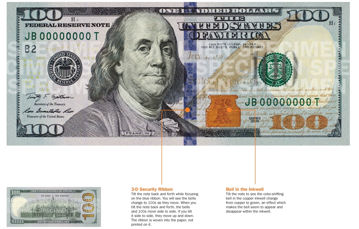 The redesigned $100 note includes a new security ribbon. The blue 3-D Security Ribbon on the front of the new $100 note contains images of bells and 100s that move and change from one to the other as you tilt the note as if it was animated. Next to the ribbon at the bottom of the front of the new note is the Bell in the Inkwell. The bell changes color from copper to green when the note is tilted, an effect that makes it seem to appear and disappear within the copper inkwell.
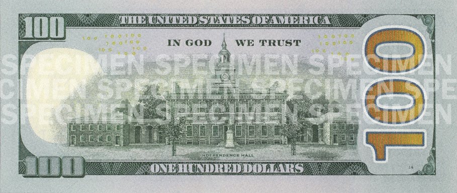 The back of the note has a new vignette of Independence Hall featuring the rear, rather than the front, of the building. Both the vignette on the back of the note and the portrait on the front have been enlarged, and the oval that previously appeared around both images has been removed. Also on the right of the reverse is a large “100” printed in gold ink. It is expected that this feature will help those with visual impairments distinguish the denomination.


